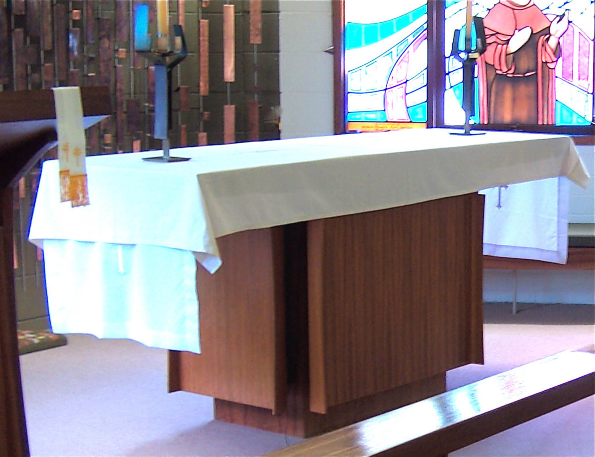
The altar is a simple table with three front and end panels which impart a degree of elegance to an otherwise plain box. It was either made by Heinz Frank from blackwood. It is a great pity that the altar cloth is so insensitively draped over the top as it utterly spoils the graceful lines of the woodwork. A narrower, plain white runner over the top and ends would have allowed the form of the wooden altar to be expressed and add its elegance to the rest of the furnishings in that view.
The two candlesticks of silicon bronze and stainless steel were designed to complement the lines of the cross and the reredos screen and to present the minimum visual obstruction for the congregation to the screen behind.
The stained glass windows arrived later and are awful, making little attempt to harmonise with the furnishings – I had no say in them. The window frames are frightfully domestic and make no effort to create an appropriate atmosphere in the chancel area. This is what happens when there is no aesthetic control by one competent person in an organisation – a problem that goes right back to the inadequate attention paid in secondary education to the visual nuances and delights that become available to those who are sensitive to their presence.
(a better photo is needed)


