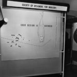
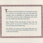
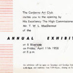
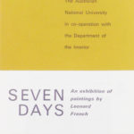
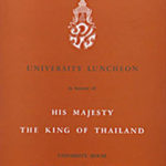
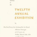
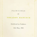
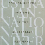
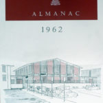
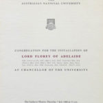
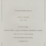
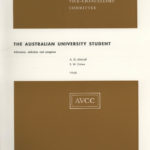
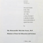
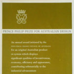
Graphic design is a logical extension or part of the study of architecture. Just as the differing styles opf architecture reflect the climatic and social needs of the various communities at various times around the world, so do the various forms of written communication.
The many qualities of language and their drawn or written forms can be eloquently expressed in ideographs or letterforms which have qualities of elegance or gracefulness, boldness or timidity and widely varying degrees of readability or legibility.
Since the days of Gutenberg and Caxton when multiple production of the printed word became easier and widespread, designers have created new typefaces just as architects have created new architectural styles to meet new needs, both seeking improvements in function and appearance.
Like many architects I have become captivated by the variety and elegance of some letter forms having perhaps a subliminal urge to do more with less, using the materials and techniques with economy of resources which contribute to elegancewhich perhaps satisfy Mies van der Rohe‘s dictum of “Less is more”.
In my first years in Sydney (1949-50?) I took an evening course in letterpress typesetting at Sydney Technical College, struggling to try to understand the mechanics and aesthetics of type sizes embodied in lead slugs, leading, kerning and all the other nuances of the now old-fashioned letterpress typesetting trade. That must have been a decade before offset printing became common, bringing new freedoms to the graphic designer in juxtaposing type and images on the printed page.
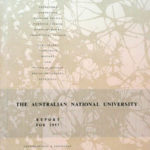
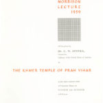
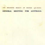
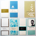
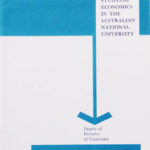
Designers need opportunities to practice their skills and I was able to cut my teeth at the University of Technology (now University of New South Wales) by designing a few small publications, but it was after 1957 when I had joined Fred Ward at the ANU Design Unit that many opportunities presented themselves for me to hone my aesthetic sensitivities using the printed word + images. Glynne Jones became The Information Officer for the ANU and he opened the floodgates for me to integrate graphic design into the ANU Design Unit.
These opportunities lasted for quite a few years and I like to think that I was able to introduce some graphic ANU presence, until the pressure on my time became too much and I was able to justify a more qualified Graphic Designer position within the ANUDU. David Walker joined us and eventually John Read joined him as assistant and that lasted for a few years. David returned to Perth WA after about three years, however, and Adrian Young replaced him until the time came from higher up the chain of command for Graphic Design to be a Unit in its own right. (Was the ANU Design Unit getting too strong for the administrators to handle ?)
That was a bit of a setback for an integrated design presence in such an important institution but in retrospect it is the only design component which has survived. This speaks volumes about the underlying ignorance about the need for better design by the administration within an educational institution. The Australian cringe factor remains with us and the sooner we establish design thinking within general education the better. (see my many papers on this topic – try ‘Social design’ segment)
